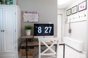

Why Calm Colors Work So Well
Calm colors can make a home feel more comfortable, welcoming, and easy to live in. They often help a room feel organized without looking plain. Soft shades can also highlight natural light, make small spaces feel more open, and create a smooth transition between rooms.
Calm does not always mean white, beige, or gray. Muted greens, gentle blues, warm taupes, soft pinks, and earthy browns can all create a peaceful mood. The best choice depends on your home’s lighting, layout, furniture, and personal style.
Before choosing a color, think about how you want the room to feel. A bedroom may benefit from a quiet, restful shade, while a living room may need a color that feels relaxed but still lively. Starting with the mood you want makes the selection process much easier.
Start With the Light in the Room
Light has a major effect on how a color looks. The same paint can appear warm, cool, bright, or muted depending on the direction of the windows and the type of lighting used after sunset.
Natural light considerations
– North-facing rooms often receive cooler, softer light. Warm neutrals, creamy whites, muted yellow, and gentle peach can help the room feel more inviting.
– South-facing rooms usually receive more direct sunlight. Cool greens, blue-gray, and soft stone shades can balance the extra warmth.
– East-facing rooms are brighter in the morning and may look cooler later in the day. Soft beige, pale green, or warm white can work well.
– West-facing rooms receive warmer light in the afternoon and evening. Gray, blue, and balanced neutral shades may help create a calmer look.
Artificial light also matters. Warm bulbs can make colors appear more yellow, while cool bulbs may bring out blue or gray tones. Test your color choices in both daylight and evening light before making a final decision.
Choose a Relaxed Color Family
A color family gives you a starting point and helps keep the room visually consistent. Instead of selecting a color only because it looks attractive on a small sample, consider how it will work across walls, furniture, fabrics, and accessories.
Soft blues
Muted blue shades are often associated with water and open skies. Pale blue, dusty blue, and blue-gray can make bedrooms, bathrooms, and reading corners feel peaceful. If a blue looks too cool, balance it with warm wood, woven baskets, cream fabrics, or brass-colored accents.
Gentle greens
Soft sage, olive, and eucalyptus shades bring an outdoors-inspired feeling indoors. Green works well in living rooms, kitchens, home offices, and entryways. Choose a gray-green for a quiet appearance or a warmer olive tone for a more grounded look.
Warm neutrals
Beige, taupe, oatmeal, and creamy white create a flexible background for many decorating styles. Warm neutrals are especially useful if you enjoy changing artwork, pillows, or rugs throughout the year. They provide calm without competing with other elements in the room.
Muted earth tones
Soft terracotta, clay, sand, and light brown can make a space feel comfortable and connected to nature. Use lighter versions on walls and deeper tones in small details, such as cushions, pottery, or framed art.
Soft pink and lavender
Dusty rose, blush, and muted lavender can add warmth and personality while remaining gentle. These shades work particularly well in bedrooms, dressing areas, and quiet corners when paired with cream, light wood, or soft gray.
Pay Attention to Undertones
Undertones are the subtle colors beneath the main shade. A white may have yellow, pink, blue, or gray undertones. A beige may lean green, pink, or gold. These small differences can affect how colors look next to your flooring, cabinets, and furniture.
To identify undertones, compare several samples from the same color family. Place them beside a bright white sheet of paper and observe whether they appear warm or cool. You can also compare them with the largest fixed features in the room, such as wood floors, countertops, tile, or a sofa.
When possible, coordinate undertones throughout the space. Warm flooring usually looks natural with warm paint colors, while cool gray tile may pair better with blue-gray, soft green, or neutral white. Matching every undertone is not required, but avoiding strong clashes will help the room feel more balanced.
Use the Five Color Sample Rule
Never rely on a tiny color card alone. Paint a sample on a large piece of white poster board or directly on several sections of the wall. Move the sample around the room so you can view it near windows, corners, trim, and furniture.
Observe the sample at different times:
– Morning, when natural light may be cooler
– Midday, when the room is usually brightest
– Evening, under lamps and overhead lights
– On cloudy days, when colors may look more muted
Give yourself at least a day or two to live with the samples. A color that seems perfect in the afternoon may look too dark or too cool at night. Testing prevents expensive repainting and gives you more confidence in your final choice.
Create a Simple Color Plan
A calm home usually benefits from a clear color plan rather than a different bold color in every room. Choose one main neutral or soft shade, one supporting color, and one or two accent colors.
For example, a home might use:
– Warm white as the main wall color
– Soft sage in the bedroom or office
– Natural wood and woven materials for texture
– Muted blue in pillows, artwork, or small furniture
Repeating colors in different rooms creates flow. The colors do not need to match exactly. Using similar shades in rugs, curtains, artwork, and accessories can make the whole home feel connected.
Balance Calm Colors With Texture
A room filled with pale colors can sometimes feel flat. Texture adds interest without making the space feel busy. Consider linen curtains, wool rugs, woven baskets, wood furniture, ceramic pieces, or velvet cushions in quiet tones.
Patterns can also work well when they use a limited palette. A small botanical print in sage and cream or a striped rug in beige and gray can add character while preserving a restful atmosphere. The goal is to create variety through materials and shapes rather than relying only on strong color contrast.
Consider the Room’s Purpose
Choose colors that support the way each room is used. Bedrooms often work well with soft blue, green, lavender, or warm neutral shades. Living rooms can handle slightly richer versions of these colors, especially when balanced with light furniture or natural textures.
For kitchens and dining areas, warm whites, gentle greens, and sandy neutrals can feel clean and inviting. In a home office, muted blue or green may create a focused but comfortable setting. Hallways and entryways can use a consistent neutral to connect rooms and make the home feel more spacious.
Keep Your Personal Style in Focus
Color trends can provide inspiration, but your home should reflect what you enjoy seeing every day. If you prefer a modern look, try soft gray, warm white, or muted blue with simple furnishings. For a traditional style, consider creamy neutrals, sage, or dusty rose. A natural style may suit sand, clay, olive, and warm wood tones.
The most successful calm color scheme is one that feels comfortable to you. Begin with colors already present in your favorite artwork, rug, fabric, or piece of furniture. Building from something you love can make the rest of the room easier to design.
Final Tips for Choosing With Confidence
Before buying paint or large furnishings, review your choices using this checklist:
– Test colors in the actual room.
– Check them in natural and artificial light.
– Compare samples with floors, furniture, and trim.
– Look at undertones, not just the main color.
– Use a limited palette across connected spaces.
– Add texture to keep soft colors interesting.
– Choose a shade that suits the room’s purpose.
– Give yourself time to live with samples.
Calm colors are less about following strict rules and more about creating a sense of balance. By studying your light, testing samples, and choosing shades that work with your existing home, you can build rooms that feel peaceful, personal, and welcoming.